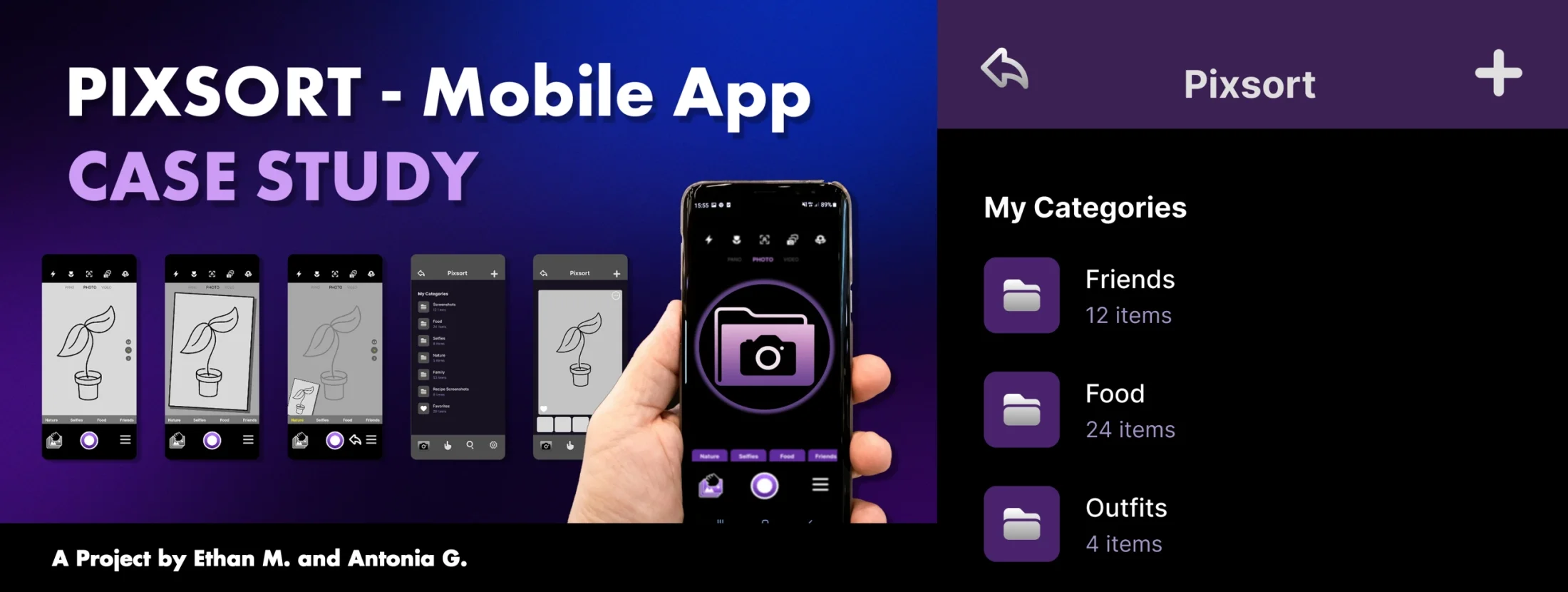
What is Pixsort?
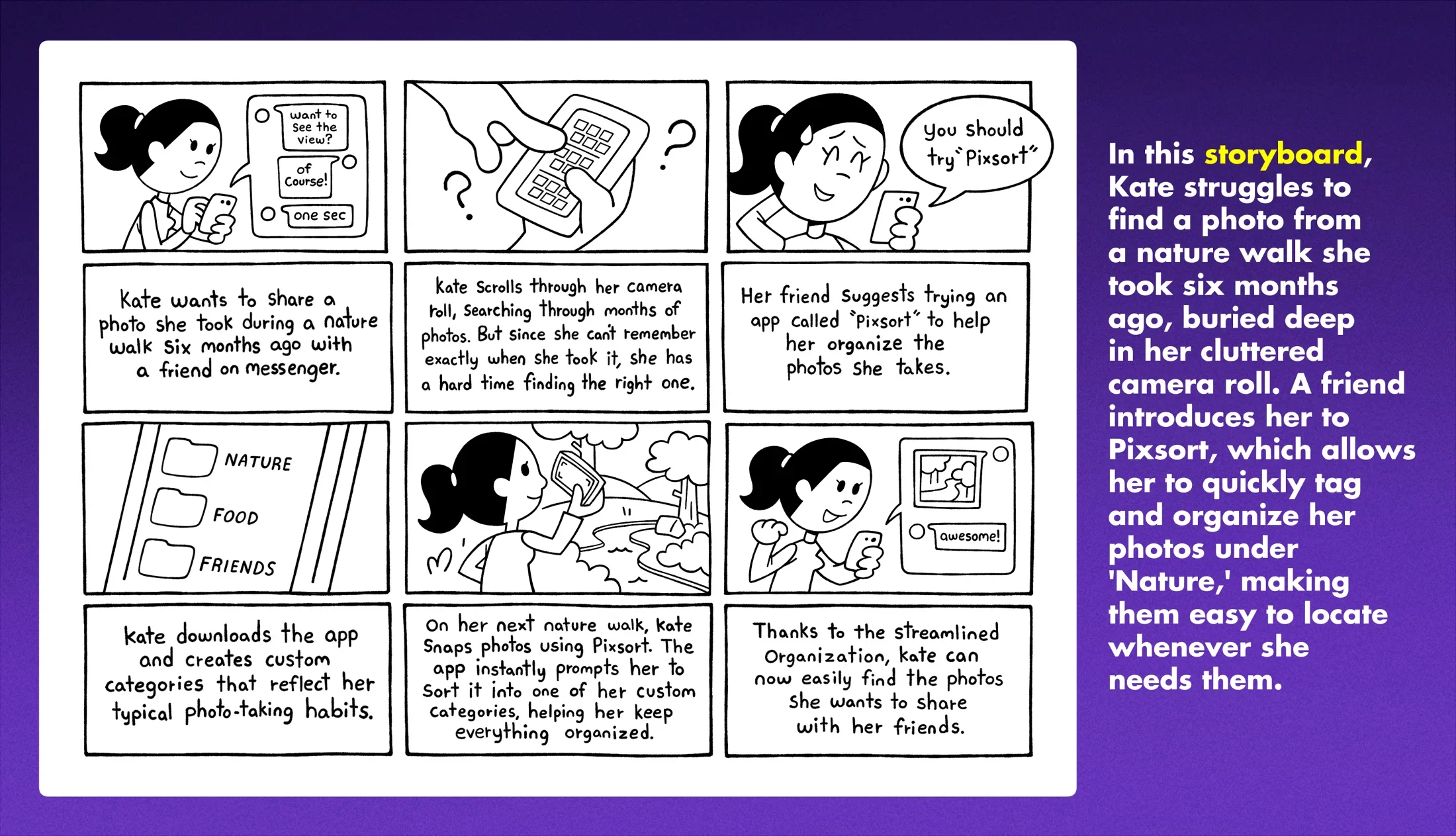
Pixsort is a camera and photo app designed to simplify and transform the way people manage their growing photo libraries. In a time when smartphone users capture thousands of images, the camera roll has become both a social necessity and a cluttered mess. We designed Pixsort to solve this problem by seamlessly integrating organization into the every day photo-taking experience.
Timeline and Scope:
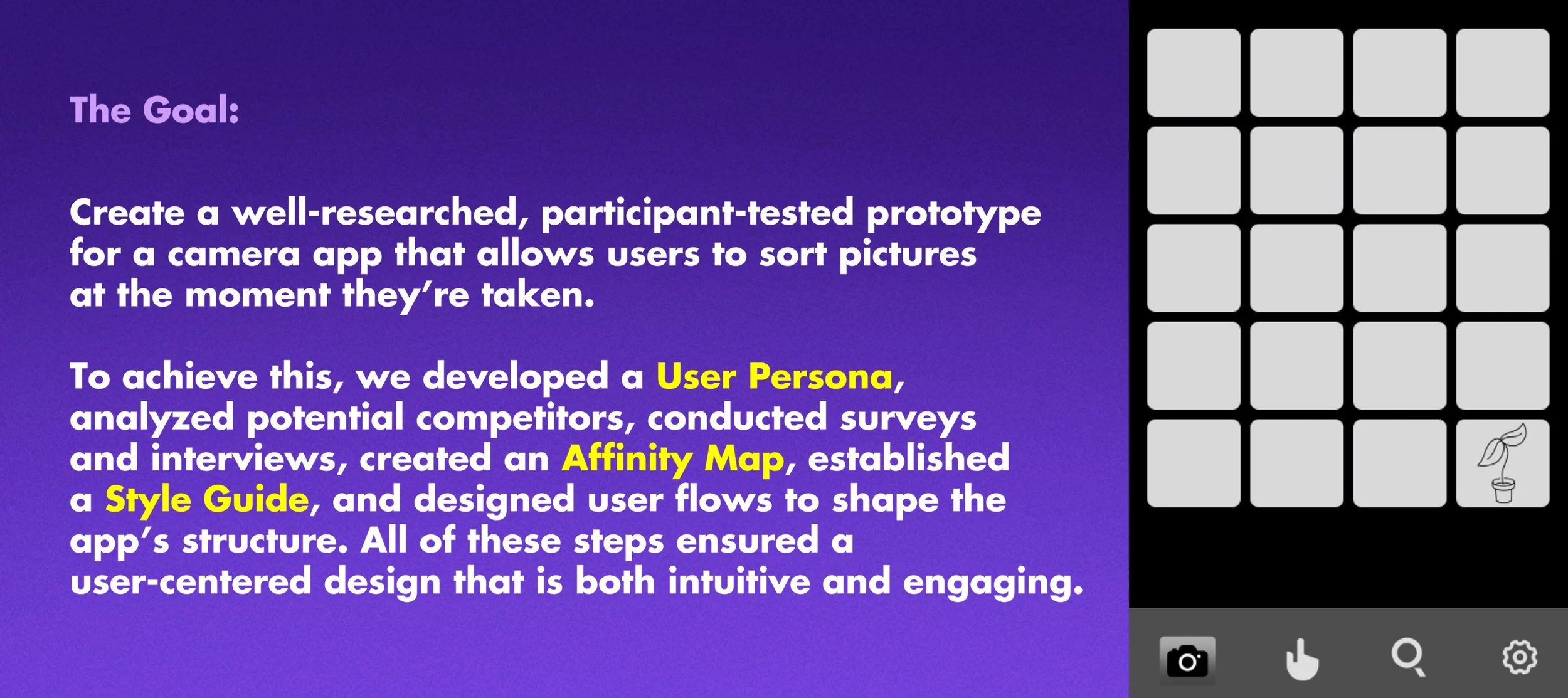
A four-week timeline was established for developing a prototype and creating a comprehensive case study that details each step of the design process, from initial research to wireframe iteration. The project was a collaborative effort between the two team members, with responsibilities shared to leverage our strengths.
Initial Approach:
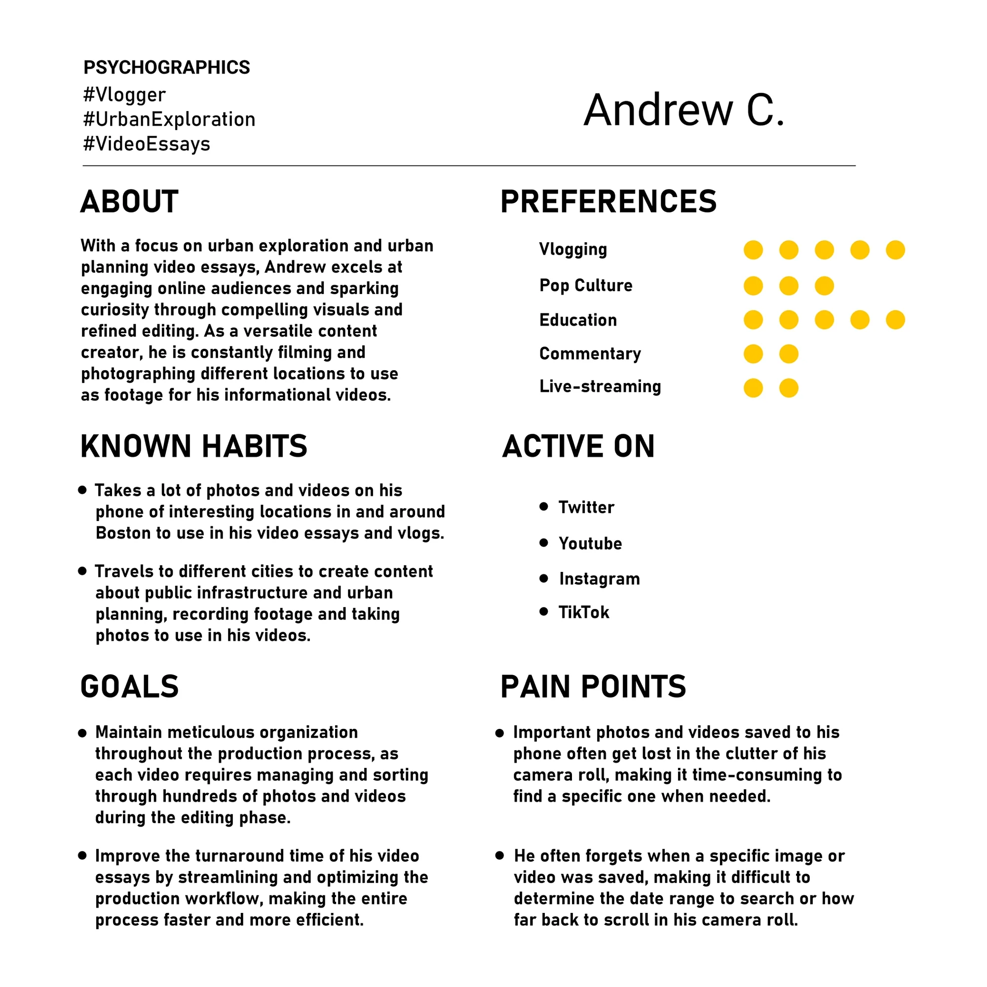
We began by identifying a hypothetical user who struggles to find specific images in their camera roll due to an overwhelming number of saved photos. To better understand our target audience, I created a User Persona of a young professional whose career in online video essay content makes them more likely to embrace an alternative camera app. This exercise helped us explore the user's pain points, preferences, and behaviors, which directly informed our design approach.
What Makes Pixsort Unique?
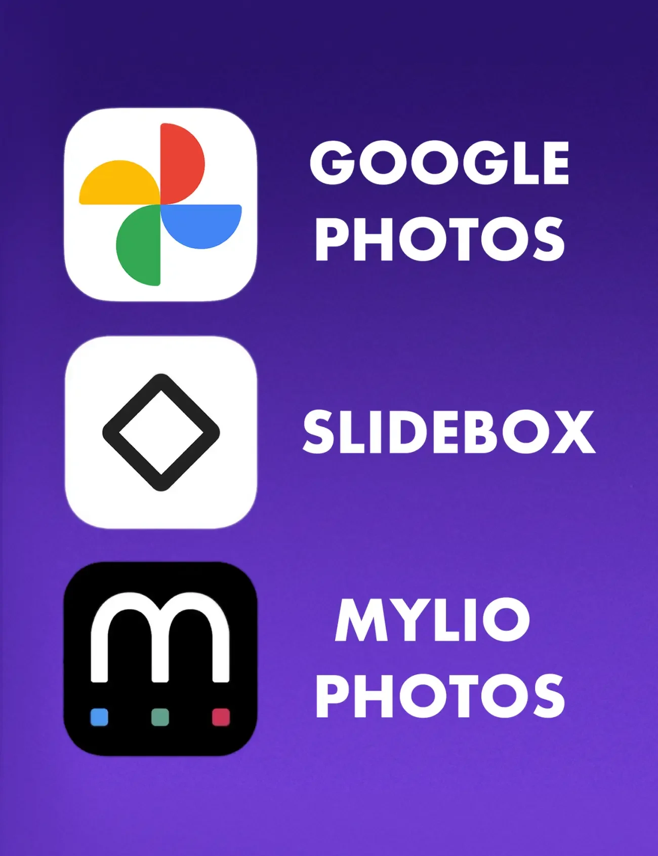
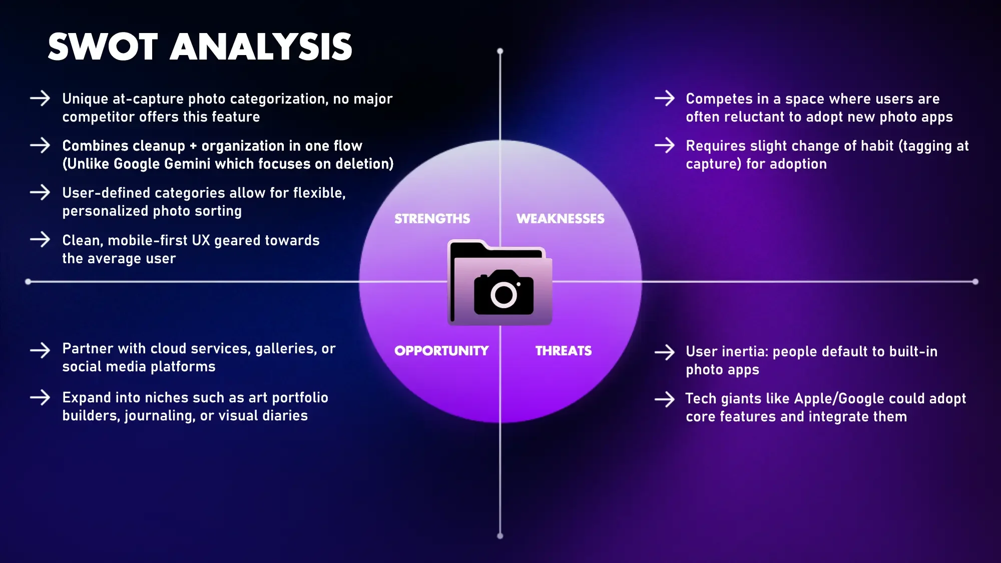
Antonia evaluated several photo apps with organizational features (Google Gemini, Slidebox, Mylio Photos). While some offered features comparable to ours, like categorization and sorting tools, none were camera apps that incorporated organization directly into the capture process.
This distinction makes our approach special, allowing users to sort photos and videos as they take them, which simplifies management from the start.
Our Interview Process:
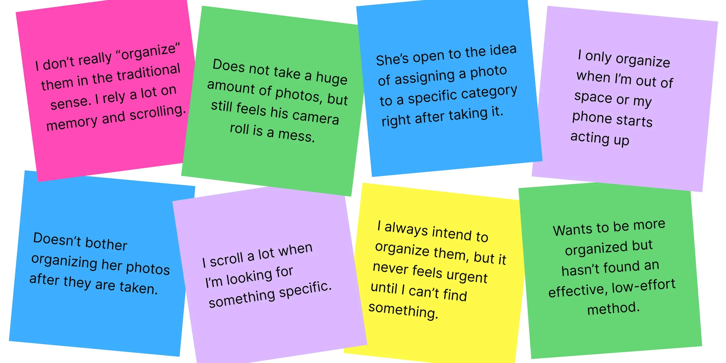
To gain a deeper understanding of the average person’s everyday photo-taking habits, we conducted informal interviews with friends and colleagues. Our goal was to better understand how people use their cameras, what motivates them to take photos, and how they manage, categorize, or sort their images over time. Using these insights, we can focus our design efforts on features people will actually use and benefit from.
Survey Analysis:
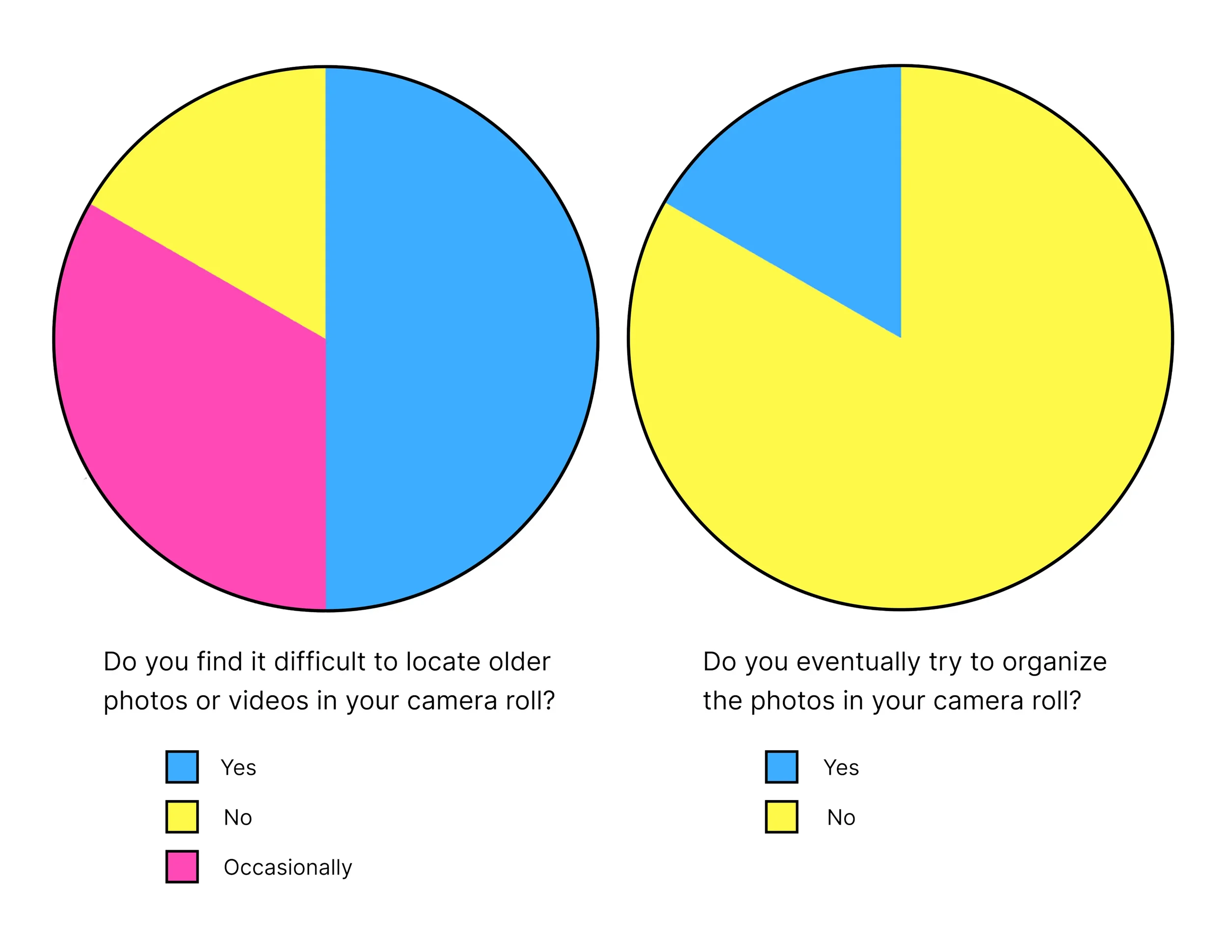
Our survey revealed that while most users struggle to find images in their camera roll, they rarely spend time sorting or organizing them. Only 15% of respondents said they have no difficulty locating older photos or videos, while 80% admitted to not organizing their libraries at all. This gap highlights the need for new solutions to photo management.
Low-Fidelity Wireframe:
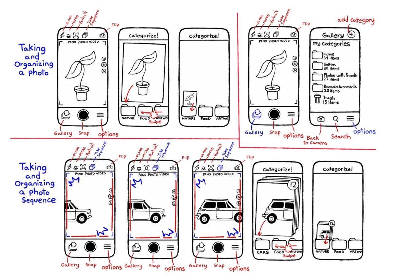
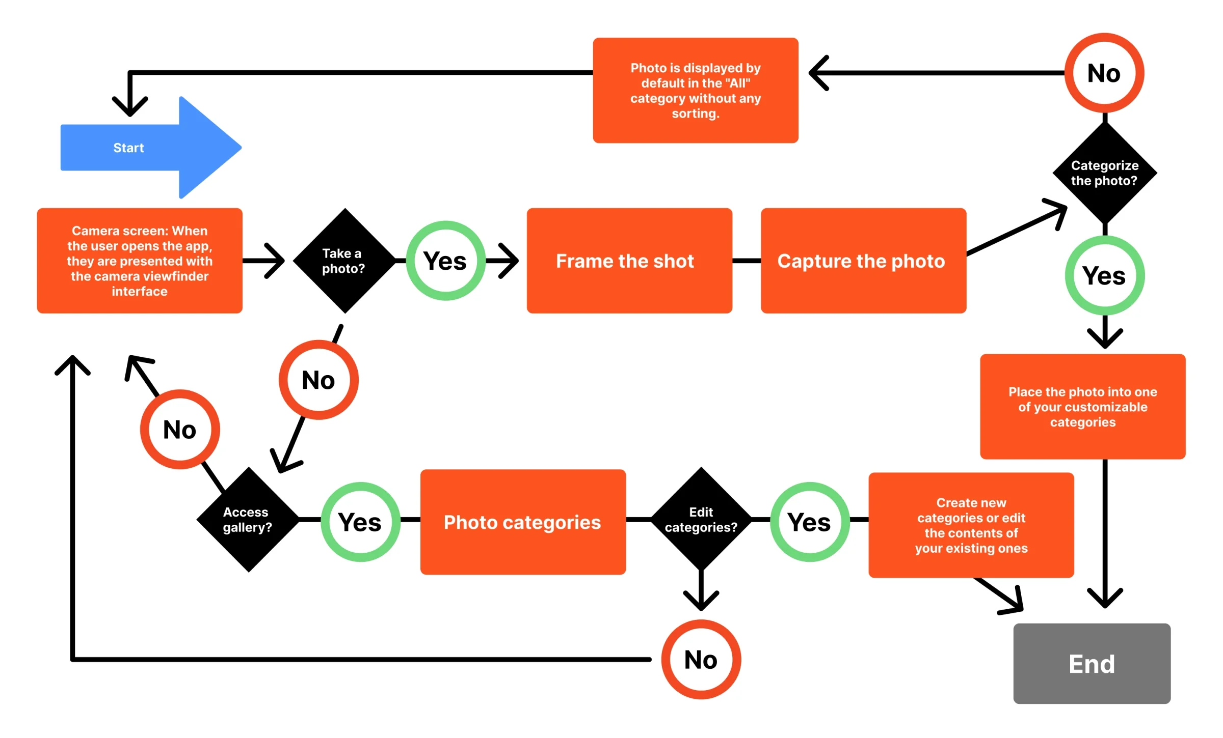
We designed our user flows to reflect familiar smart phone camera interfaces, integrating our "sort after capture" feature into an experience that users already find comfortable. After categorizing a photo or a series of photos, users are returned to the viewfinder, creating an uninterrupted loop.
Style Guide:
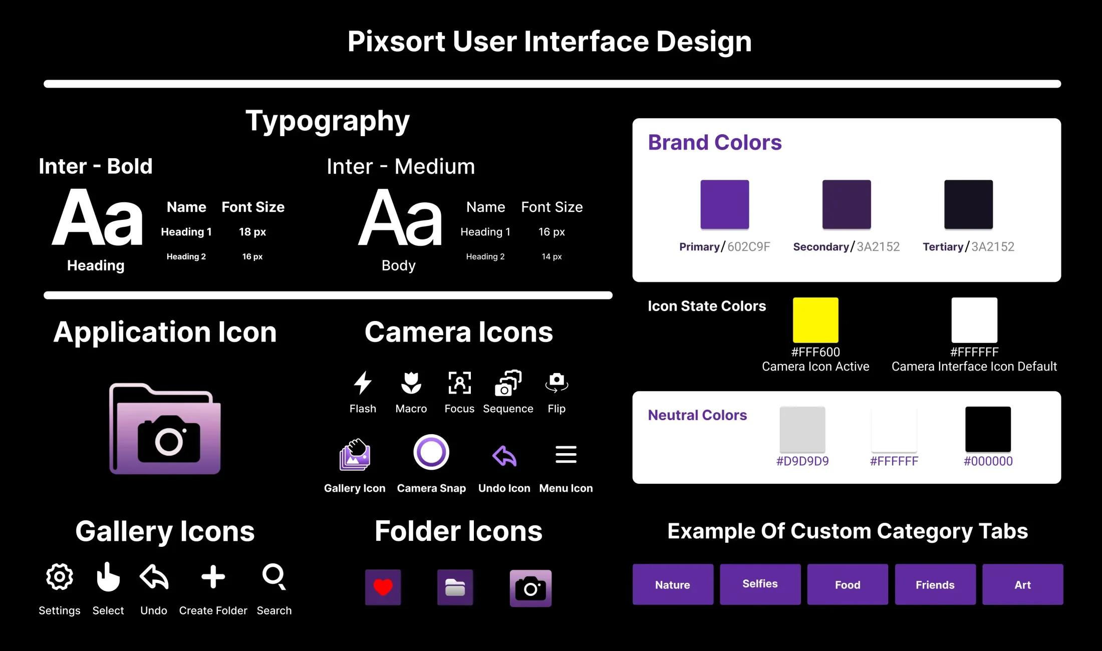
To ensure design consistency across the app, I created a style guide that reflects our unique visual identity while incorporating familiar icons from standard smartphone camera apps. This approach helps ease the transition for users who may be hesitant to switch from their current photo-taking app. We agreed that the typography, color palette, and iconography should align with modern design trends to deliver a stylish user experience.
Snap and Sort!
We developed a Prototype in Figma to showcase and test our user flows. Through this, we gathered valuable feedback from friends and colleagues on specific design choices. The prototype closely simulates the real user experience, allowing users to preview what it would be like to use the app on their phones.
Our Mid-Fidelity Prototype Demonstrates Two Key User Flows:
Capturing and categorizing a photo immediately after it is taken
Taking multiple photos to categorize after the photo-taking session is complete
Both flows highlight a smooth, user-friendly experience designed for efficient photo organization. The prototype also includes folder navigation, allowing users to easily view and access photos within their assigned categories.
A/B Test:
We conducted an A/B test with friends and colleagues to find the most effective layout style for the sorting interface.
Users were asked to choose between Version A, which featured clear, segmented tabs, and Version B, which offered a sleek, minimalist carousel design.
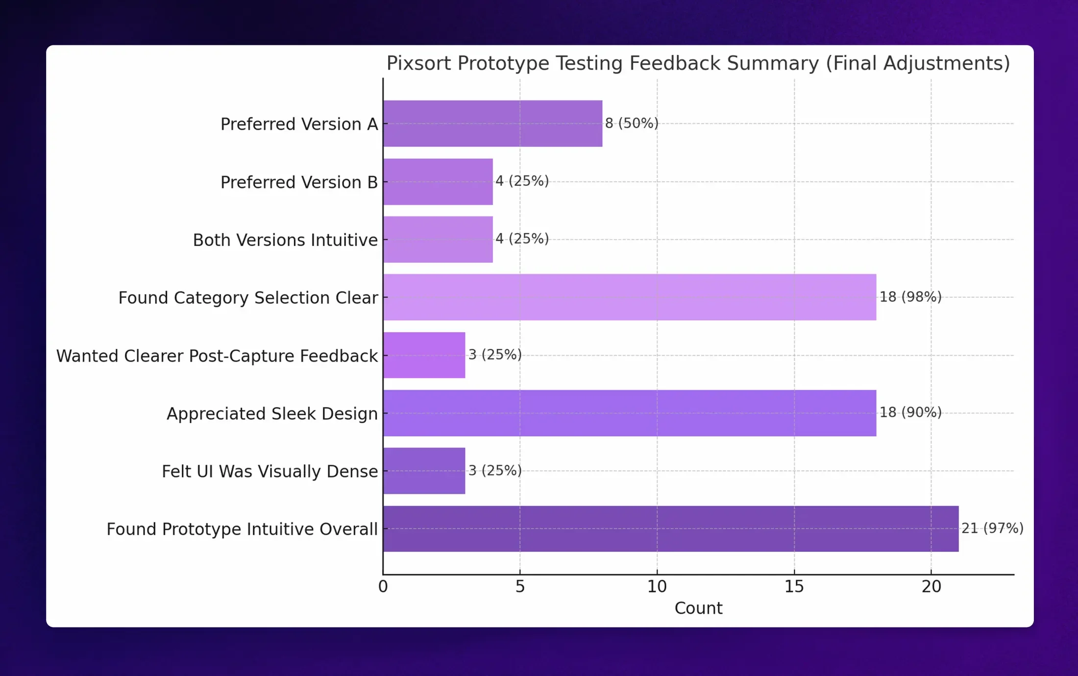
While many users said Version B looked more modern, a significant number found Version A easier to use and more intuitive. Our team went with Version A because the use of tabs was widely understood as a familiar method of categorization, reminding people of folders, which greatly contributed to its clarity.
Final Thoughts:
User feedback on the Pixsort Prototype was overwhelmingly positive, with enthusiastic support for the core concept of organizing photos at the moment of capture. Testers found the interface intuitive, the category selection easy to use, and the familiar camera and navigation layout instantly recognizable. Based on these insights, our next steps are to develop a high-fidelity prototype using finalized assets and real photography. We will also expand functionality by building out the options menu and adding an image editor screen for basic photo adjustments.
