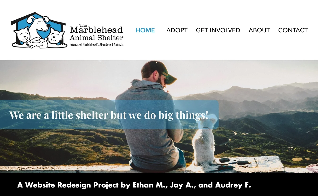
The Marblehead Animal Shelter is a small, volunteer-run organization in Marblehead, Massachusetts.
The Goal:
Redesign their outdated website to improve usability, enhance navigation, better showcase adoptable animals, and add volunteer application forms.
This project was part of our UX/UI Bootcamp with Columbia University, where we partnered with a small nonprofit in need of a website overhaul. It was a great opportunity to apply our design thinking, user research, and prototyping skills in a real-world setting. We also got to work on something featuring adorable animals!

Timeline and Scope:
The project had a six-week timeline, covering research, wireframing, prototype development, and the creation of a detailed case study documenting each stage of the process. Led by our project manager Jay, the initiative was a collaborative effort among the three team members, with responsibilities split up to make the most of each person’s individual strengths.
Dividing the Work:
For each wireframe stage, we first explored layouts on our own, then collaborated to combine the strongest design elements into a final wireframe. We also divided specific tasks by user flows.
Our Initial Impressions:
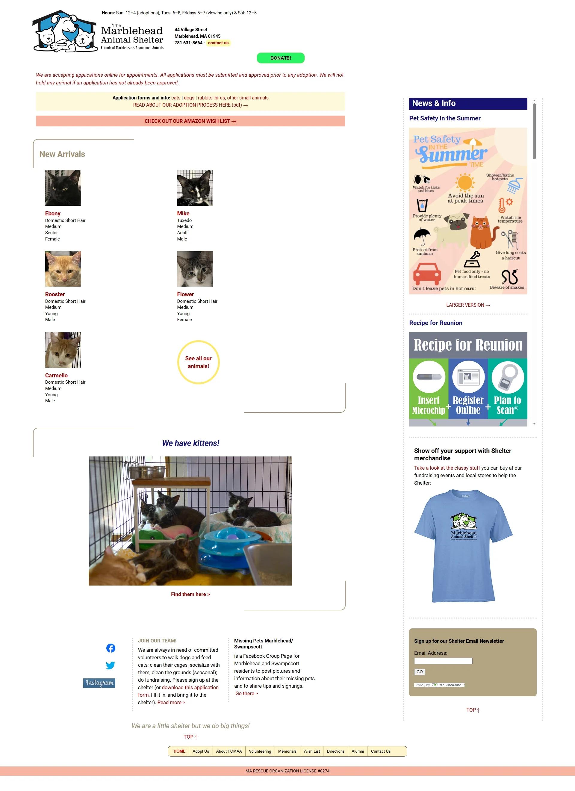
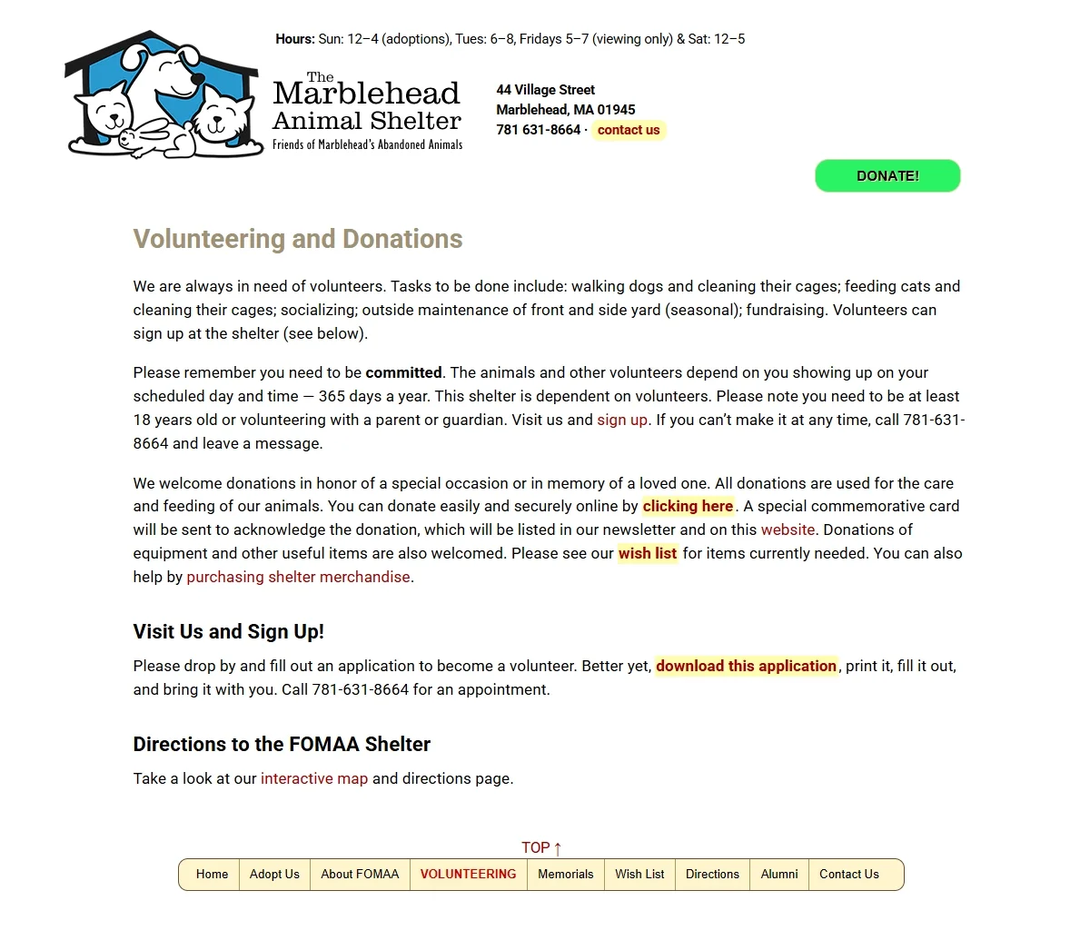
We began by assessing the original website, which was confusing, mainly due to its layout. The navigation bar was placed at the bottom of the page, which is highly unusual and made it inconvenient to use. The color scheme also presented issues, as it lacked a consistent style or design strategy. Additionally, the homepage felt unbalanced, with the news gallery on the right side of the page receiving disproportionate emphasis.
Another significant concern was the Volunteer Application Process, which could not be completed online and required users to print the form and submit it in person. This outdated method creates a barrier for individuals who don’t have easy access to a printer and may discourage potential volunteers. Offering a digital alternative would help increase participation.
Exploring User Needs:
We created a User Persona to represent the hypothetical individual interested in pet adoption. This helped us wrap our heads around the specific needs and preferences someone might have when adopting from a shelter, including practical considerations such as living in a small space or managing a hybrid work schedule.
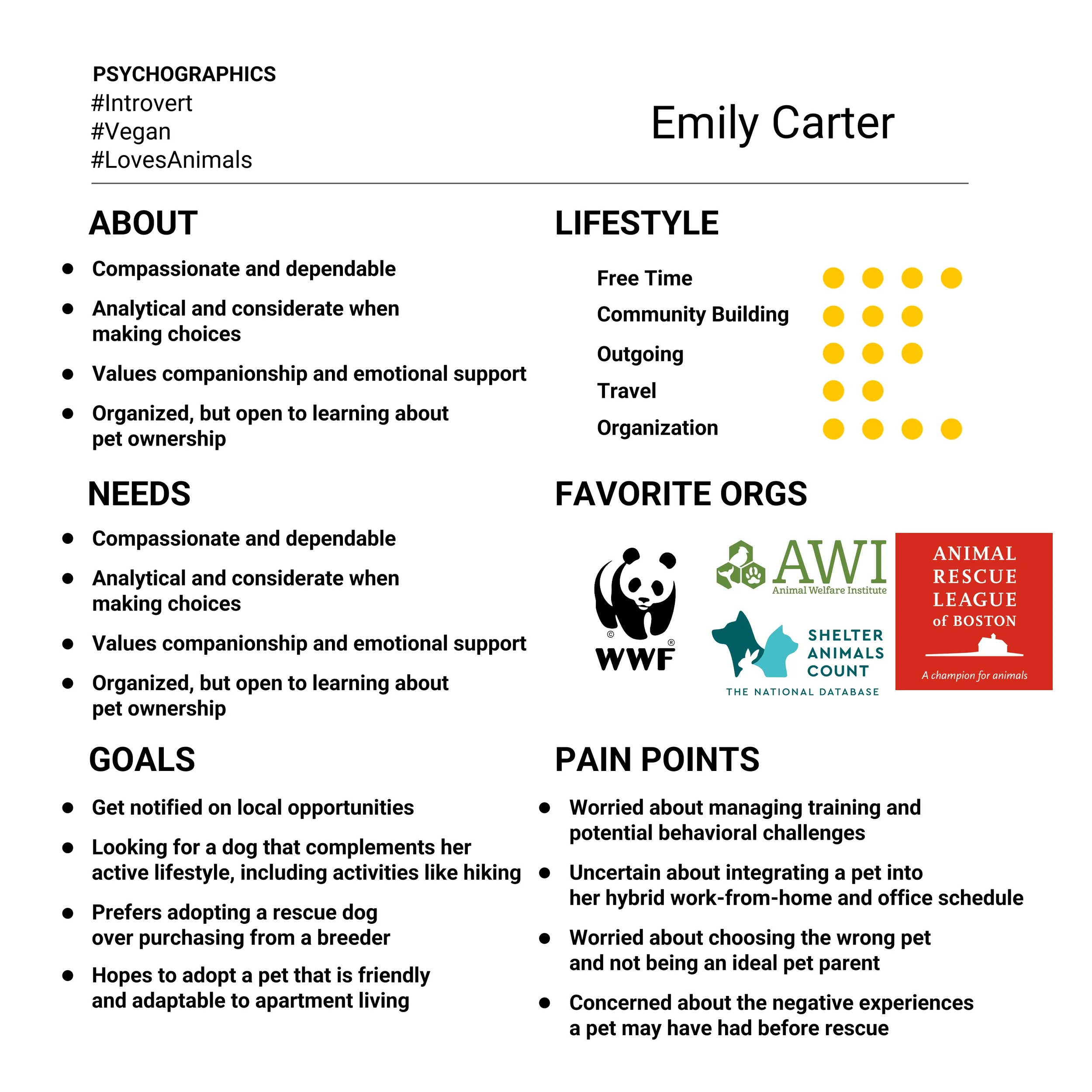
Motivation of the User:
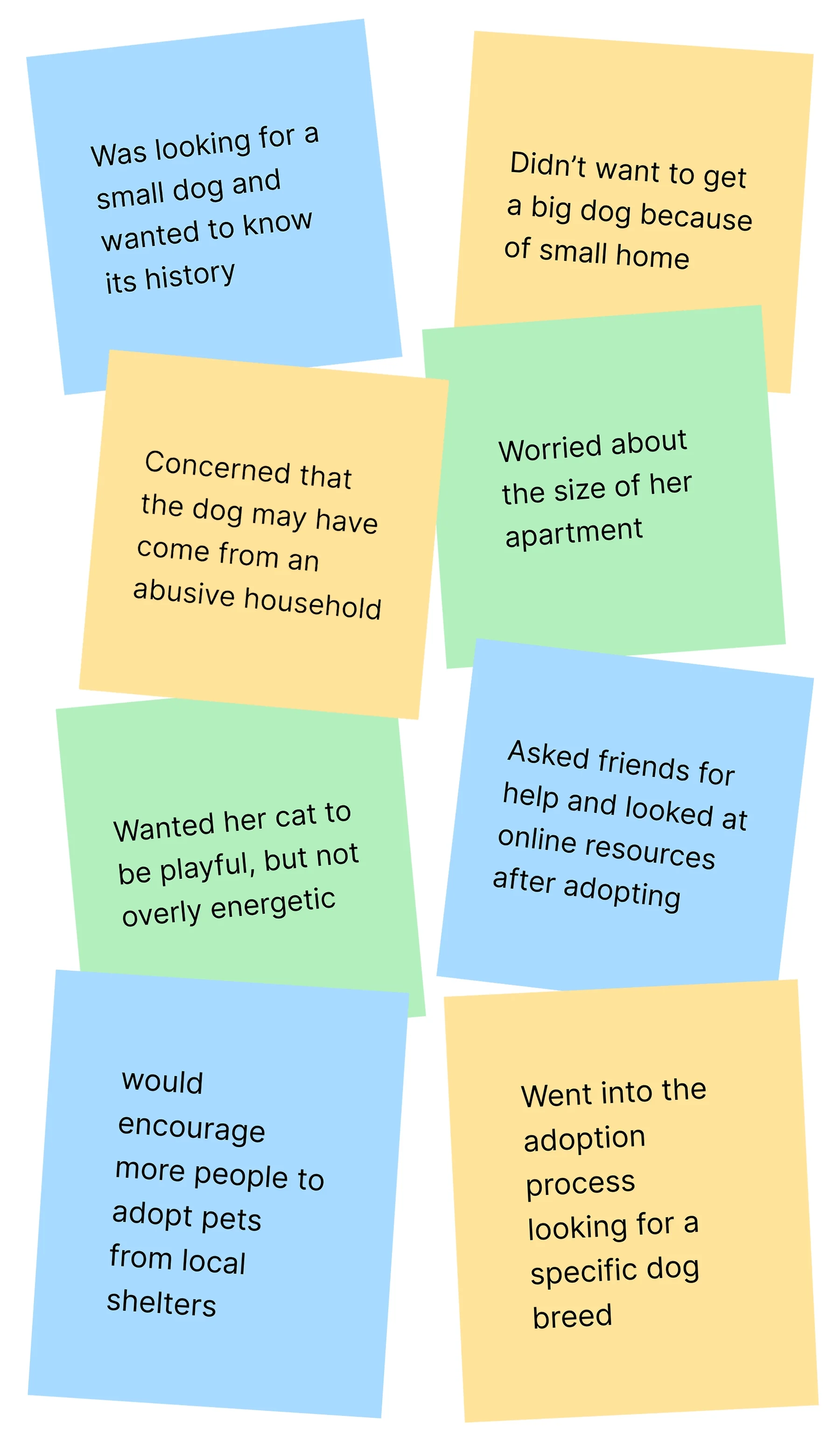
We conducted interviews with friends and family to discover how people approach pet ownership and the adoption process. As our conversations progressed, repeated priorities emerged, highlighting what matters most to people when choosing a pet.
Their age and breed
The pet’s temperament and whether they are a suitable match for the owner’s daily routine/lifestyle
If they are trained already or how difficult they may be to train
Where the animal came from or any possible traumas
Thoughts on the Original Website?
We asked our interviewees to explore the original website and complete simple user tasks, such as finding the adoption page for a specific animal or locating the shelter volunteer application. We also asked for their general thoughts on the website’s design and layout. Interviewees found it disorganized, with a confusing structure that made simple tasks unnecessarily difficult.
Difficulty locating the navigation bar
Accessing the adoption form for a specific pet was not straightforward
No clear visual hierarchy in the design
Design Challenge:
Following our interviews, it became clear that users browsing animal shelter websites expect a streamlined adoption application process and the ability to complete volunteer registration forms in just a few clicks.
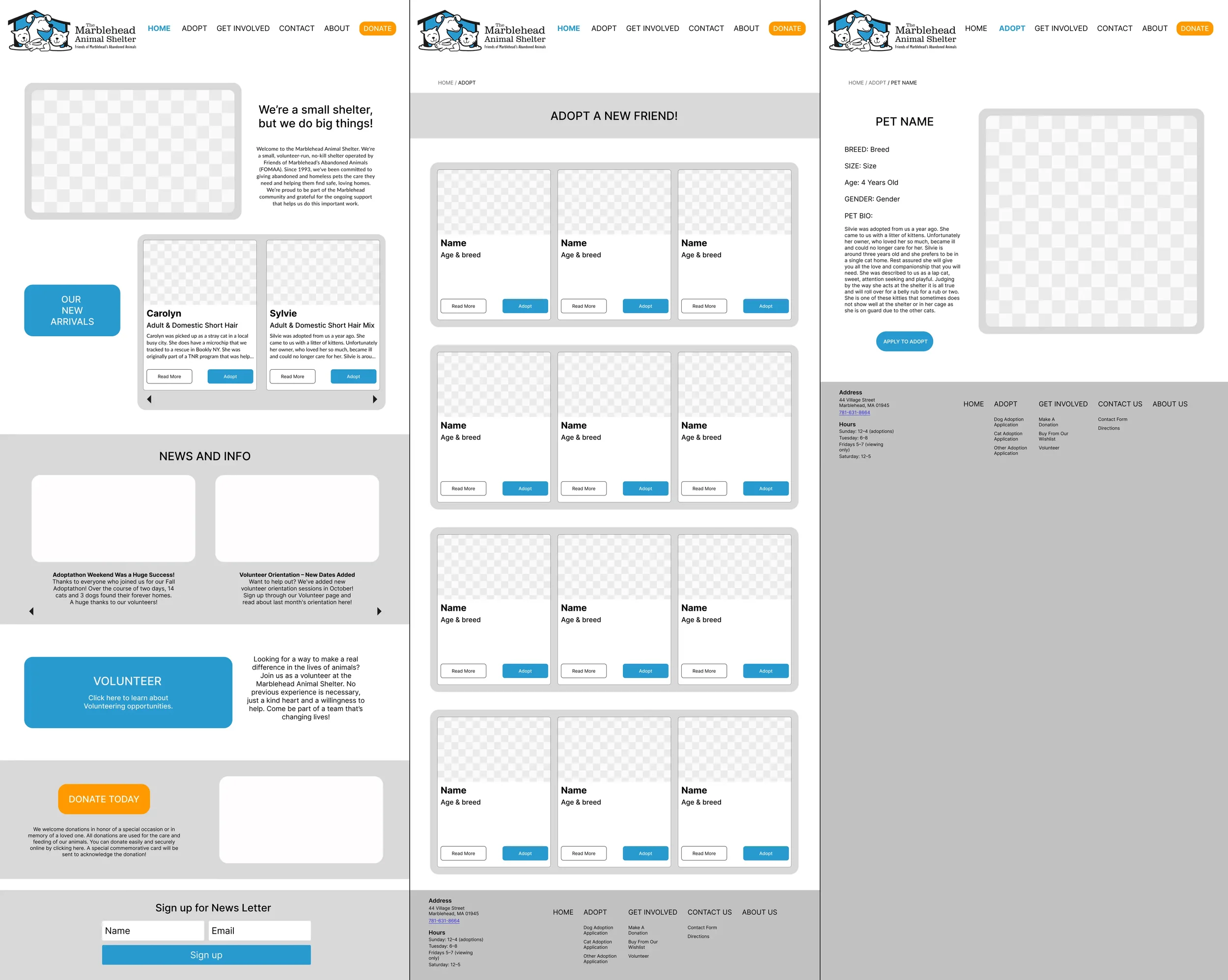
Individual Wireframing:
After agreeing on some basic enhancements, such as improved navigation and a more modern layout and look, we each created our own Mid-Fidelity Wireframes of the site’s main pages to explore and visualize our design ideas. This individual process helped us clarify our personal approach before coming together to collaborate and align on a shared vision for the redesigned website.
Featured Below: My Home Page, Adoption Page, and Pet Profile Page
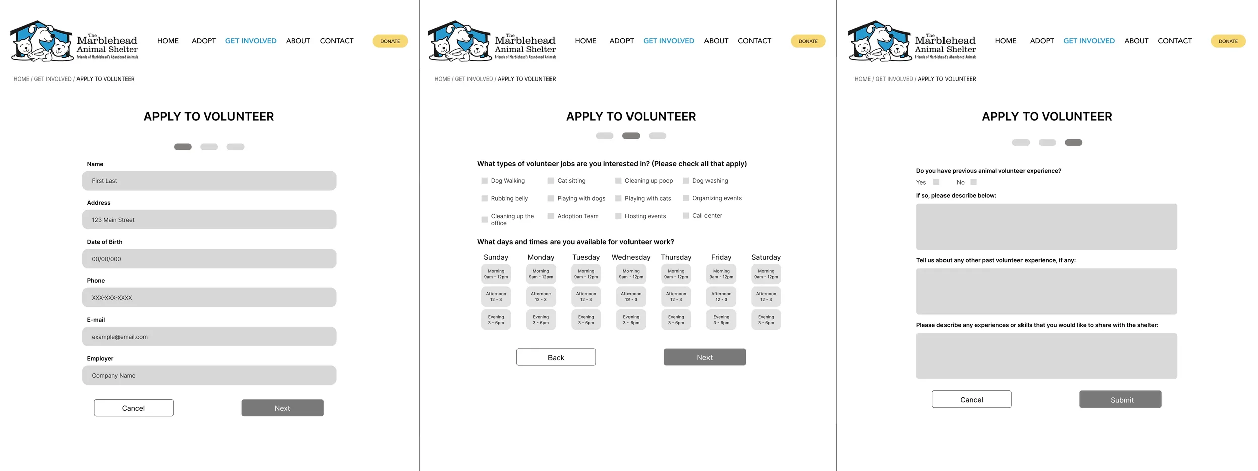
Volunteer Application User Flow:
Audrey and I worked together to design the user flow for the Online Volunteer Application. The original website lacked an online application, requiring users to print, complete, and mail in the form. For our complete overhaul of this experience, we analyzed user flows from similar websites. Our objective was to simplify the original questionnaire into a three-step user flow that clearly communicates all essential information.
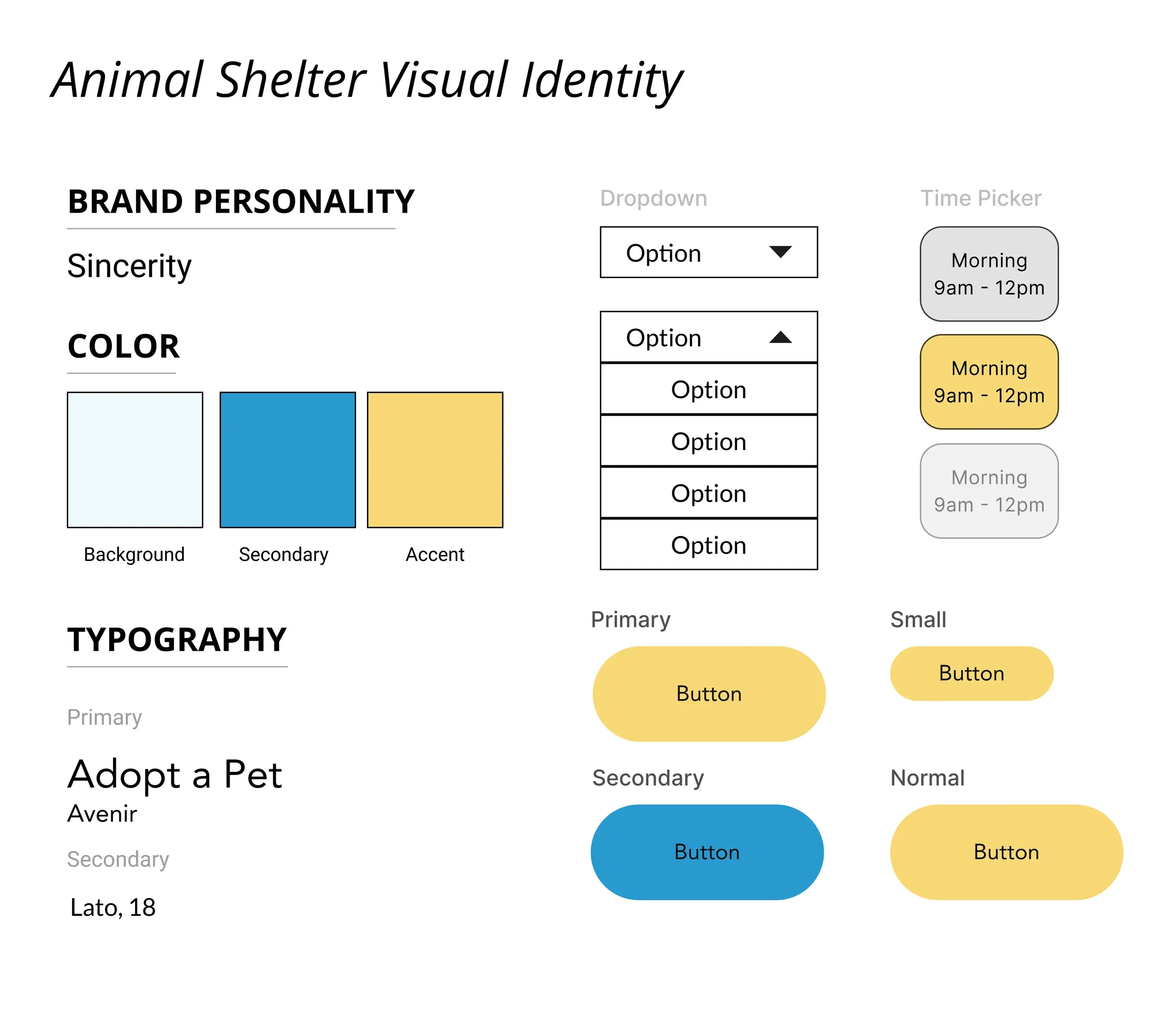
Style Guide:
Following our selection of a color scheme inspired by the shelter’s logo, Jay designed a set of standardized components to support the final round of wireframe iterations. These components were essential in ensuring consistent use of headings, typography, colors, and overall branding, helping us maintain a cohesive visual identity across all sections of the site as we began building our High-Fidelity Wireframes.
Adherence to UX/UI Design Principles:
To ensure a clear understanding of the design rationale, I annotated our collaborative High-Fidelity Wireframes, highlighting key UX/UI concepts such as Gestalt principles for layout clarity, micro-interactions for user feedback, and the use of visual hierarchy and color theory, which were instrumental in maintaining consistency.

What Did People Think?
As a team, we gathered user feedback from 10 Users on our Figma Prototype. Based on their input, we further simplified page transitions, made pet images clickable for easier navigation, and improved the application flow by redirecting users to the homepage after completing the application.
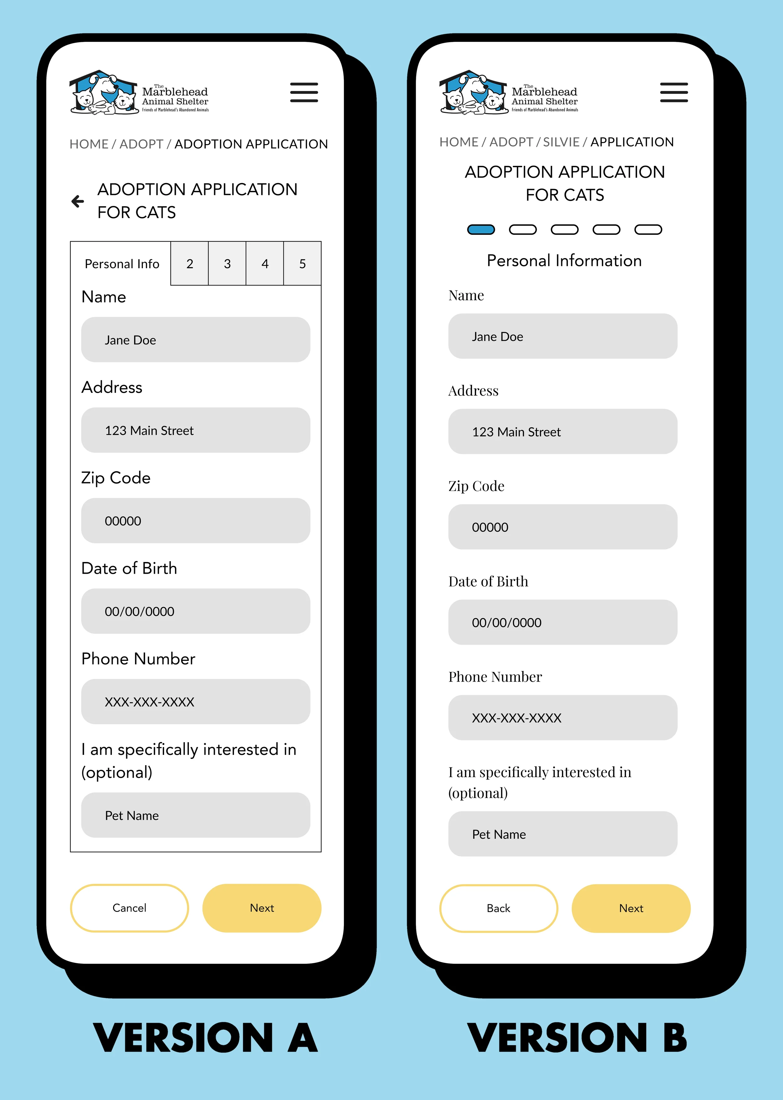
A/B Test:
Our team evaluated two possible designs for the mobile version of the adoption application user flow, both created by Jay. We invited participants to try out both versions and share their feedback.
Version A used a tab-based layout that closely mirrored the desktop experience. Version B featured a simplified, more spacious design inspired by the layout of our volunteer application.
Among the 28 Participants, 57% preferred Version A, citing its familiarity and alignment with the existing desktop adoption application interface.
Next Steps:
To move the website redesign forward, additional breakpoints should be added to better support a wider range of devices and viewports. For the Developer Handoff, it is important to have a clearly written guide for the handling of edge cases and error states to ensure consistency across all pages on the site.